new thread


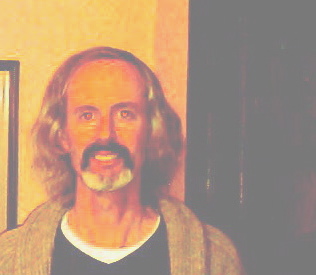
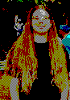
This is kind of interesting to me (I have time to kill this evening), well, ...now that I've messed around with it, my interest is migrating to an unread newspaper upstairs, but anyway, I found by accident that if you take a photo with a cheap, low res. camera (2 mp in my case), crop it down and blow it up until it starts to pixilate, then throw the brightness and contrast out of wack, you wind up with a photo that looks more like a bad watercolor impressionistic pop art thing. see below...
Looking good, Rob! The pic AND the hair. Never thought about pushing contrast and brightness around like that. Thanks for the tip!
--Rick
If you don't have any real graphics software, and you're running Windows, you can get a similar effect by saving images as 16-color. Because the color space is so small, you'll get w funky sort of false color sometimes.
A more sophisticated version of this is at work in the Charles Schwab commercials. They throw out the low bits of the colors (the easy part) and then they smooth out the lines to make it look good (the more sophisticated part). I don't know if their process is totally automate or not. Perhaps they have humans touching frames and then the computer "tweens" them. I'm too lazy to really find out, too.
yeah, that looks pretty cool! Kind of retro late 60s peter max or andy warhol. it could have been a poster for a Filmore West or Cow Palace concert