new thread

I think we have to change it because it makes people think that we're some ugly-guy worshiping community...
Huh?
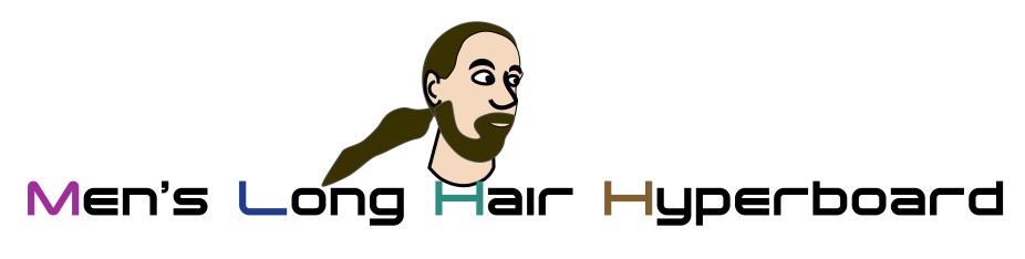
Well ugliness is in the eye of the beholder :) The image isn't any particular person but seems to be a more or less accurate portrayal of a longhair.
So what pretty guy should we change to? Just curious if it was the specific face you didn't like or that there is a picture of a face at all. I really am not sure what you are getting at here.
And just who are these "people?" Has their talk that I myself am an ugly guy worshiping this community being talked about everywhere? (Not that this would phase me in the least.)
I am the President of the MLHH. The logo was designed especially for us by a well known artist who happens to be one of our members and manages our Gift Shoppe which was of his creation as a possible way to raise funds for us so that we will "always be available as a free site for all!" The artist (Luckskind) in designing the logo has depicted an individual (no specific person) but a general image that represents a guy with long hair as this is what the MLHH is all about.
Many many guys with no place to turn have been encourged and helped here, and not always in an area that is directly related to long hair as ocassional ot. posting do appear.
May people who "think" that we are an "ugly worshiping community" go elsewhere. All it takes is a single click of the mouse.
Some comments just dont need to be posted.....
If this site makes you uncomfortable by being associated with it, then that is easily corrected. We love this site and wish it never to be changed.
peace
clayton
Maybe I have some weird tastes, but that guy in the picture looks ok to me. Nothing ugly at all about him :S
While I don't go so far as to say that the logo inplies ugly-guy worshipping, I wonder if a re-branding make-over would, perhaps better represent the diverse nature of our group. Perhaps keeping the current design while also rotating it with other logos showing vbarious styles, lengths of hair, hair colour and texture variations (maybe a few curls and dreads for good measure), and the colour of the man wearing his Manlocks™. Perhaps, using silhouettes or stylized two-toned images in contrasting colours (like the Longhaired Dreamer series) so that it doesn't look like we are under the banner of a single individual.
No question to the value of this site and I have enjoyed being a member for about a year. The logo is irrelevant to the value I have received. That said, if one claims the logo represents a 'typical' long-haired male, then it requires that 'typical' means a white, straight-haired man.
Those are my thoughts,
Shawn (Mr.Crow)
When the idea of a logo first came about my first reaction was "Why on Earth do we need a logo?". Well that is still my feeling about the subject so I pretty much just ignore it (this is no disrespect to all the hard work Justin and Luckskind and Bill and who knows who else did in creating it, all at no cost to anyone as it was done with love for this site).
Being a white straight haired guy I did say that to me the picture looked typical. Well Shawn is right, that probably isn't fair but to be honest I simply never questioned it. It really is hard to see the world differently than you see the world. :)
If the logo does cause grief (and I don't think it does for anybody but the original poster of the thread, for as yet unspecified mysterious reasons), but if enough people feel they are excluded by the image, I would rather it be removed than have a parade of pictures trying to match something of all the user types here. Luckskind was extremely generous in doing one picture, I can hardly imagine the work of doing all that Shawn suggested. In reality I think we do nothing and continue with business as usual.
This is an interesting thread whatever happens :)
We have younger guys and older guys. We have guys of different races. We have guys with hair from shoulder to butt length. We have curlyhaired and straighthaired guys. How many longhairs would it take to show all that "diversity"? The word I just quoted, to be honest, always makes me cringe a bit, because most places I've seen it used, the effort ends up including some people but excluding others altogether, and the more people you include, the more blatantly obvious the exclusion becomes. One place I worked, for example, had a "Department of Diversity", and their web site had lots of rotating faces on them, but they were all young shorthaired people. As an old longhaired person, I felt more excluded than if I had seen just one guy there.
As for our logo, the artist was told by the site's trustees to include one or three longhairs. We did not want two, because we are clearly not a dating site, and having two would give that misconception to some people. We did not want more than three for clutter reasons. The longhairs depicted were to be "typical longhairs" and not be any real person. The artist did as we requested.
Is what he did perfect? No. Will we keep it forever? Probably not. But enough people like it that "it's good enough", especially since no one presented any alternative, and considering the work involved in doing so, probably aren't anytime soon going to be. Also, after the artist's doing all that work, mind you for free, out of appreciation we are not apt to dump it until it has had a decent running time, unless there is REALLY something wrong with it, and there isn't.
Bill
I think the logo is a fine represntation of the "average" long hair. I think the logo is great and should stay. In my opinion the only other logo that luckskind has done that's better than the main page is the "Long haired dreamer" logo - which is why I bought a t-shirt : )
Neil
That's hilarious! Since when are guys supposed to be pretty?
This is news to me as I've never heard any negative comments about the logo which I think is fine. Who are these people anyway?
It's not like were selling memberships like some buisness and we have to re-brand ourselves every two or three years to stay competitive.
Kevin
I find it interesting that all the individuals who replied to this thread with a positive "it's fine" answer, were in fact fairly straight haired, caucasian looking males. Kudos to Mr. Crow on the idea of representing more textures of hair, etc. Some of us (even caucasians) will never look like our logo. I myself have a wavy locks, and a rather frusrtating inability to grow facial hair. In anycase, I disagree that we "have to change it" but i do feel that it wouldn't be a terrible thing. Honestly, as a new guy on the board, the first thing I noticed was that the logo has a rather menacing look on his face. But, in all fairness, it's only a logo. If anyone feels it really must be changed. Please, do not say so until you have prepared an alternative. At that point, you will be given a much more welcome reception.
Actualy, I just took a look at it again. It does seem to have a rather cult-esque/psuedo religous quality. With the white garb and circular(albeit black)rennisance paint era halo style background. But again... It's just a logo. lol
Well, we could always go the Google/Dogpile approach and just rotate images in and out depending on the day, season, or holidays. More work, but I'm sure we would have contributors on the board.
My only REAL suggestion would be to make it smaller, overall. The site was designed, as far as I can see, with bandwidth in mind, so pushing a needlessly large image to visitors just seems like a waste. Emphasis on "seems", as I'm not sure how much this actually makes a difference, what with browser caching.
I have never liked the logo, but I am not one to complain about matters that do not severely impinge on my personal happiness.
It is a composit, so not really alive. Even a doll can have long hair. I would prefer that we use images of members of the Board who are wlling on a month by month rotation.
If there are more persons who wish to represent us than we imagine, then we can have a waiting list.
This is the beginning of an essay on how we can restore democracy, provide universal health care, and recover the American Economy from its Babylonian captivity.
J.
the only thing that the logo has ever made me think was, 'wow! that looks just like this guy i used to date!' (shut up, chris g.) :)
and i certainly don't think it makes people think of an ugly-guy worshipping community. the majority of you guys are pretty good looking, in my humble opinion.
I have nothing bad to say about the current logo. I can see that someone put a lot of time and effort into its creation. That person is to be thanked and commended for a job well done.
If, however, the board decides to have a makeover, I would suggest staying away from something that defines ANY demographic. I think that we celebrate being a man and having long hair . . . period. We don't care if it's white hair, brown, blonde, red or black. We don't care if it's straight, cruly, or somewhere in between.
Here's an idea proposal:
You don't have to use it. You can take it free. Or, you can take elements from it.
Cheers!
Banana