new thread


What's with the new header? I liked the old one tbh.
I do remember Bill making mention of this a few days ago and I did notice they are not using Luckskind's logo. With alot of website designs are refreshed from time to time. I'm sure that the "tech crew" and moderators have the sites best intentions are heart.
Cheers,
John.B
I like it!!!let's face it Change happens!!!!
Well Done, Tech folks !
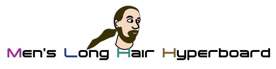
The new header is crisp, clean and modern.
WWT
Yes I did notice that myself.I also noticed the Gift Shoppe is gone as well.I'm sure its just a refreshing of the site as was mentioned.Anyway theres no place like home:)Mark
The gift shoppe had a flurry of sales the first month it opened, which was about a year ago. Then it had probably met pent up demand, because sales dropped off. It had sold nothing since this past May. Also, much of its merchandise had a logo we are no longer using, and besides that, its annual renewal had just come up, meaning we'd be spending funds on an endeavor which no longer brought in any. All this pointed to the decision to remove it.
While the gift shoppe was on line, it made MLHH about $50. The items were not sold at great profit, of course, since the goal was not to rip you all off! [grin]
MLHH still takes donations, of course, and that is now our only source of income. A few days ago, Absalom (our treasurer) told me we have enough in the bank right now to keep the site running for about a year. Links to the page that tells how to donate are easily found on the site's pages when any of you get the urge to.
Bill
Hey Absalom, could you please tell us how much money is needed to keep this site running for a certain amount of time. That way when someone donates (probably me when I have the $), I know that i'm providing for say, one month of the website being online.
We are looking at the monthly cost right now. Our site draws monthly traffic in the high 20s of gigabytes. Until a month ago, it cost $10 a month for up to 25 gigabytes and $25 for up to 100 gigabytes. Penalties are steep for going over the plan that one is on, so it was a no-brainer to get on the $25 plan. Each plan also comes with a limit to the amount of data one can have stored on the site, and the $25 plan of course allows more. A lot more.
Last month they raised the $10 plan's monthly traffic limit to 125 gigabytes, however we need to look at our data storage needs before just pouncing on that plan. In particular, our archive takes up quite a bit of space, and it just keeps growing. While on the $25 plan, the space taken up by our material has not been an issue because we are alloted plenty of space.
The comment about having a year's worth of funding was based on the $25 rate. If we drop to the $10 rate, we have enough cash for 2-1/2 years, however we may have to decide what to do about the archives' size before then if we make a change of plans. On the other hand, they may raise the storage for the $10 plan by then, since every few years they have, and then we'd have no worries again.
Absalom and I talked about this last week, and we will be asking the crew to consider the two options soon.
Bill
Longhaired men are a very limited audience and the sales reflected that.
Looking at it from a psychological standpoint, perhaps longhaired men are not
interested in calling more attention to themselves than they already
are!
Anyway, while the retail sales actually were in the hundreds of dollars, the actual profits were very meager.
An anonymous couple paid for the Shoppe's renewal last year and were ready to do so once again, but we all agreed it just was not worth it.
Justin wrote a very nice email to that couple thanking them for their generosity.
The Gift Shoppe was an experiment; none of us knew where it would end up--and now we know!
It was fun and we learned lots of technical stuff.
We would like to thank all those who made purchases and who supported out efforts.
Actually the gift shoppe made us only $28.64, on 5/15/2007.
I checked the records. That was it. It is too bad it did
not do better. In concept it seemed like a good idea at
the time. In reality it was a disappointment. Hopefully
closing out the account will net a few dollars more.
Scott
At one point the retail sales were almost $300., but CafePress took so much of
the profits AND they also automatically took out monthly operating expenses.
They would NOT accept funding from other sources until they used what was owed them from the PROFITS!
We were so glad that the MLHH was going to get this $300. until
we saw all of the above deductions. By the time they had taken out their piece of the pie
(which was too big if you ask me) there was very little left.
...it needs just a bit more (breathing) space between the links and the posts.
Nice colors. Center the title? Did that look good.
Remark: In the world of Longhairs, it is very difficult to come up with
any kind of image that wil please everyone. A while back it was suggested that
"different hair types" were not being represented--and this is true.
In the end having an image in a logo representing such as site as this one might very well prove impossible.
Anyway, the change is refreshing. Spacing, fonts, placement and general design may change over time but it will have no effect on many different types of Longhair men out there.
Thank you for allowing me to make an attempt at the impossible!
n/t
I think it's great!!! Good work, guys!!!
I think either header works, and let's show our appreciation to "The Crew". A big round of applause to to all that make this site work so well, Tech crew and Moderators!
Bravo!!
Bruce
...I hope they decide to center it like before. The links get layed out differently, and the font is not as nice. They've sacked the image, which is fine by me though. I'm reluctant to critique though, since AFAIK the new design isn't settled.
I assume there will be some kind of announcement when it's "done".
Centering is a somewhat complex issue. People have lots of varying widths at their disposal. Nowadays a lot of younger guys with great vision have large high-resolution monitors on which centering looks weird, while others have lower resolution and smaller monitors. The consensus among today's designers seems to be to create a page of limited width and put it on the left side, so we have gone with that. With a twist, though.... We allow the list of messages to go as wide as the user has his browser set to. This lets those with high res monitors take advantage of what they have, while sparing others of the frustration of scroll bars at the bottom of the page, should we force the design to be wide.
Many designers now go for a width of around 950 pixels which accommodates a 1024 monitor with scroll bars. An older standard was to use 750 pixels which accommodated 800 pixel monitors with scroll bars. We are sticking with 750 for information pages like the FAQs, because we are not providing cluttered content-rich pages like news media sites, and we see no reason to frustrate those with smaller monitors when we really don't need the "real estate".
As we always have, we strive for simplicity and for accommodating everybody, while not sacrificing content in the process. This latest round of design changes is intended to be wholly cosmetic. If anyone encounters any functionality problems, please let us know at once! Put another way, the site should WORK just like it always has.
Fonts are tough on the Internet. Besides there being personal preferences, different operating systems and web browsers treat them differently. We've drifted in the now-somewhat-standard direction of having a sans-serif font for headlines and a serif font for other material, but the latter we actually do not specify. This allows the user to set whatever font he wants, but most browsers come with a serif font as standard. (Serifs are those little marks like you see on the top and bottom of a capital I, for example.)
As for "when it is done", this depends on how much time I have and how my wrists feel about the endeavor. [grin] They got a bit tired of the computer yesterday. For now, you will see a mixture of the old and new styles. When the changeover is done, I'll post a message to let you all know, and after then, if anyone sees any "old style" material, we'd want to hear about it.
And answering others' questions, yes, certain aspects of the "look" may be temporary. The move at the moment is to bring the pages up to a layout that is common in 2007 as contrasted to 2000 when much of the present material was produced and thereby set the old site standards. Once an up-to-date layout is achieved, then we will be free to play around with different "looks" consistent with 2007 standards. 2007 standards include stuff like having a logo in the upper left corner that will take you back to the home page, and having common links down the left side. People expect to find that stuff now, and if it is not there, it makes the site more frustrating to use. It is a lot like expecting to find the brake pedal in the same place in all cars. The first few years cars were made, you might have found braking to be located in various places. Eventually everyone agreed where it ought to be.
We have steered clear of cascading style sheets, JavaScript, cookies, and similar browser enhancements as much as possible. These can add a nice cosmetic touch, but they do complicate the site for some users and they can react very unexpectedly for some. We do all intelligent processing on the server rather than on the users' end, so what all users get out of the site will be consistent, and will be what we intend. Our goal to make the site as accessible to everyone as possible remains intact.
Thanks to everyone for their input so far and for any that is forthcoming. We want to know how you all feel. And thanks, of course, to so many who have said they mostly like it!
Bill
Tech Crew Chief
[snip]
Well, there's the crux of the matter: HTML is not supposed to be a precise layout language. Pixels shouldn't even be mentioned. It should be percentages. It's supposed to be up to the browser, and good web pages are supposed to look good in any browser that isn't broken.
Centering looks fine on my browser. If it looks wierd on some other machine, that machine is broken. Yes. I know, I'm tilting at windmills here. The "web pages are another type of PDF" camp won the war a number of years ago. :(
[snip]
However, images are based on pixels, and most sites have images. Also, most sites, even those that go the "another type of PDF" route, set width based on pixels, not browser window. Narrow your browser below 950 pixels and you will see that: MOST sites set for that width will pop you into horizontal scroll bars. Web elements can generally be set for a percentage or a number of pixels, but not both, and narrowed percentages eventually break. It is safer for the designer wanting to get a consistent look to go instead for pixels, despite the resulting irritating horizontal scroll bars.
It may look fine to you, but when MOST people are going the left-side route, it would make our site look quirky to many people who have wide screens and see how sites mostly deal with the "too much real estate" problem. The aim is comfort here. The site is, of course, equally readable no matter where on your screen we throw it.
Bill
i would have to agree that this is not an improvement.
The header really should be centred regardless of screens and there needs to be far more 'air' in the header/listing area.
I've tossed a bit more whitespace in between the header and the messages. It did look a bit crowded and the change is an improvement I think. The downside is that a message or two that was visible in the first screenful no longer is, but that is a minor loss.
We can't center the messages because they are a list. They have to go down the left side, otherwise the dots would be zigging and zagging all over the place on their way down the page. The dots provide threading information, so they have to align vertically. We can't lock the message list into a table where it would be left-justified and then center the table, because some browsers won't show the table until all of its contents have loaded. This would give the really obnoxious response that we all hate, where a page is loading and loading and loading before anything at all pops into view. Since most people want to see what is near the top while the message list itself is very long and takes a while to load for those with slow connections, we are not going to go that route.
We could center the header even though the messages are on the left. Some guys now have very high resolution wide screen monitors though, and they would see the header way off to the right of where the messages are. I've seen that, and it looks really dumb. Curing that problem was one of the items on our list of corrections to make with the upgrade. This was not a problem when everyone had 800 or 1024 pixel-wide monitors, but now it has become one for those with today's large monitors.
We could fine-tune the site to make it exquisitely gorgeous for one user, but we have to make it work for everyone. Others have different monitors, different operating systems, different browsers with different fonts and security settings, and different connection speeds. We don't want to sacrifice operability for aesthetics. I've had several guys tell me our chat room is the only chat room they've ever run into on the Internet that they could actually use. That is because we try to be aware of the variety of equipment and software that is out there, so we don't shut anyone out. Our design credo is, "The more longhairs, the better!"
Bill
That bit of spacing made all the difference in the world!
Much better, I think too.
...so I look at web designing from an artistic and psychological standpoint.
Space IS important and almost anyone can pick up on what the lack of it does to us.
This current spacing is much better and I would even add just a bit above the title too.
Latest trends have been to slim down the vertical height of logos (the "title") so users get a better glimpse at content when the page first loads. We seek to achieve a balance between a desire for aesthetics and desire of users to see what a site contains.
The area occupied by the main page title is identical to that occupied by the area used for titles in other site pages. This provides additional comfort as users navigate between the two - it gives a feeling that they are on the same site.
The most artistic among us would go for huge "splash" pages that fill up most of the screen. This is great for displaying artwork, but it irritates regulars who have seen it a hundred times. People don't come to MLHH to see the site's artwork. They come to see material provided by the users. We strive to maintain a balance between making the site attractive while primarily displaying content.
Bill
I see both points and to be honest the minute the site comes up I immediately scan the threads and hardly notice the header.
Pretty decent clean design and of course open to tweaking.
Kevin
My three cents...
I have a few problems with the new design.
First of all, the all-lowercase title in the heading...I think it looks a bit childish or ultra-modern/hip, neither of which seems to be qualities this site embraces. I used to lay out newspaper pages and a lot of times people tried to use that all-lowercase style and it bugged me.
Second of all, the colors in the title's first letter dropcaps are just not fitting either for the same reasons as the lowercases.
Other than that, I think we could use a different picture that looks a lot less like anyone...just a generic looking longhaired man in black and clear with hair trailing...perhaps even trailing underneath and below the site's name. Of course, this site would be fine even if it was plain black text on white background.
The new header needs something.....like a picture of a
long haired man. (The old one was great.)
Are there any disabled users who have trouble with the new
header?